
TBH: Creating online content is a lot like cooking. Just throwing a bunch of ingredients together and hoping it turns out edible doesn’t really cut it. You need a recipe. You have to know exactly how much of each ingredient to add; otherwise, the final result is either a complete disaster or, if you’re lucky, just plain boring. And trust me, no one wants to click on flavorless content.

1. Why Your Content is More Than Just ‘Nice Words’
“Why should I even bother with nice visuals and a catchy title? Isn’t it just a matter of throwing a bunch of words on the screen and calling it a day?”
Well, not exactly. Content is the marketing language of the internet. It’s not only the reason people visit your website or follow you on social media, but also the reason they stick around. It’s your first impression on the customer, and you don’t want them clicking away as if you’re the online version of a sleazy salesman, right?
Think of it this way: content should be a mini-adventure for the reader. It should intrigue, engage, and—most importantly—it should be simple and easy to understand, even if the topic is actually quite dry.

2. The Magic of Good Formatting
Imagine this: you’re at a restaurant. The waiter brings your plate, and the food is a jumble of ingredients thrown together on the plate, as if the chef was in a rush to get home. Doesn’t look too appetizing, does it?
Online, it’s the same story. You might write a fantastic article, but if it’s not presented in a readable way, people will lose their appetite for it. Use short paragraphs, treat subheadings like lifelines for your text, and remember that a well-placed image here and there can work wonders.
How can you make your content look inviting? Use headings and bullet points. And don’t forget the power of white space. White space is like breathing room for your text. Too many words at once is like trying to eat an entire cake in one bite.

3. Tell a Story
Let’s be honest, nothing keeps people hooked like a good story. That’s why we end up watching 12 seasons of that show about characters who keep making the same mistakes. A story is a hook that makes your message stick.
For example, let’s say you have your own business, let’s say… vegan hotdogs. You could say, “Our hotdogs are plant-based.” Or, you could tell the story about the time you decided you no longer wanted to be part of the meat industry and set out to create the perfect vegan hotdog. Which one would you rather read?
So think about what you have to share, even if it doesn’t seem like an exciting story at first. Every bit of context, every experience, every personal touch makes your content authentic—and that’s what draws people in.
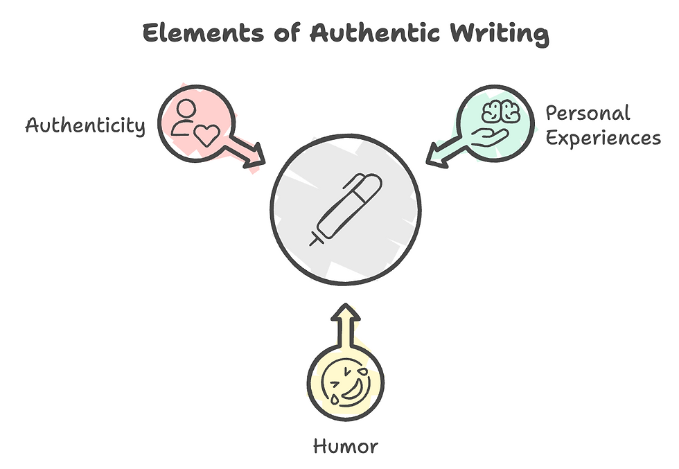
4. Finding Your Own Voice
Another thing: no one wants to read a robotic text with no human touch. In fact, if your content feels like it came from an AI generator, you’ve already lost them.
What people want is a real voice—your voice. And no, that doesn’t mean you have to be a stand-up comedian. But write the way you actually are. Don’t be afraid to crack a joke, share a personal story, or just be yourself.
Tip: try saying what you want to write out loud first, then type it up as you said it. You’ll find that your words feel more authentic and true to you.
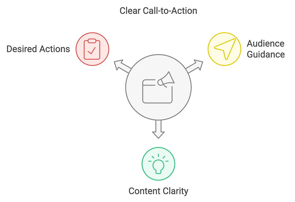
5. The Power of a Call-to-Action
“Great story, but… now what?” People love clarity. At the end of each piece of content, you want to include a Call-to-Action (CTA) that tells your audience exactly what you’d like them to do.
Do you want them to sign up for your newsletter? Check out a product? Read the blog?
Just tell them! Think of CTAs like the waitress at a restaurant asking if you’d like dessert.
Not pushy, but also not too vague. You want them to know where to go, not wander aimlessly through the rest of your website.
6. SEO - The Salt & Pepper of Content Creation
Yes, here I am again… We can’t ignore SEO. It may not seem like the most exciting topic in the world, but without SEO, no one will read your content, no matter how brilliant it is.
SEO is like the salt and pepper that gives your dish that extra something. Use keywords that resonate with your audience. Do a bit of research to see what your ideal customers are searching for, and make sure your content aligns with that. Create a checklist: “Do I have the right keywords? Are my titles search engine-friendly?”
Because let’s be honest: if no one finds your content, you might as well have written it in a diary, right?
7. Use Visuals as Flavor Enhancers
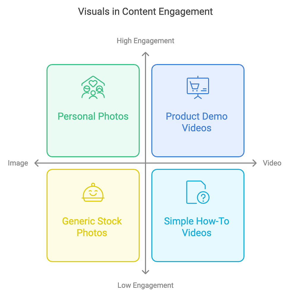
Visuals aren’t just filler for your content; they’re the sauce that brings out the flavor. A great image or a catchy video can add that extra something words sometimes can’t convey. People process visual information much faster than text—it’s just the way it is!
How do you choose the right visuals? Think about what you want to communicate. Use images that really add value. No stock photos of people grinning at a salad (nobody eats that, let’s be honest). Choose photos that match your message, reinforce your story, and reflect your brand identity. And if possible, create them yourself—it feels much more personal to your audience.
Videos are, of course, the holy grail in the content world. Make a short video explaining your latest product or a quick how-to that shows what you have to offer. People love watching a face or an action; it grabs more attention than a simple image. But remember, you don’t need to be Spielberg to make a captivating video. Keep it simple and authentic, and you’re good to go.
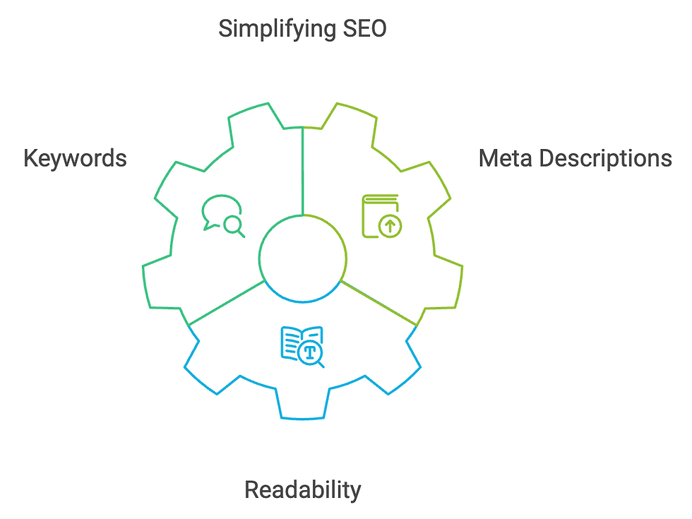
8. SEO Without the Jargon
Let’s demystify SEO for a moment. You might think, "SEO is hard and time-consuming." Yes, SEO can take some work, but it doesn’t have to be as complicated as it sounds. Instead of thinking of SEO as some mystical science, think of it as a series of helpful habits that make you more visible.
Think of keywords as the ingredients that make your dish tasty. Keywords are the words and phrases your audience searches for when they’re trying to solve a problem or learn something new. Use these words in your titles, subtitles, and even in the filenames of your images. It’s like making sure your tomato sauce actually tastes like tomatoes—it has to make sense.
And then there’s the famous “meta description.” Basically, it’s a short, catchy text that people see when your page shows up in Google. Think of it like the blurb on the back of a book. This is your chance to entice visitors to click on your link. Use action-oriented words like “discover,” “learn,” and “get.”
Also important: your content needs to be readable. Long sentences and complex words don’t do well with search engines. So try to keep your paragraphs short and use language that even your grandma would understand (unless your grandma was a math teacher, then maybe simplify it a bit!).
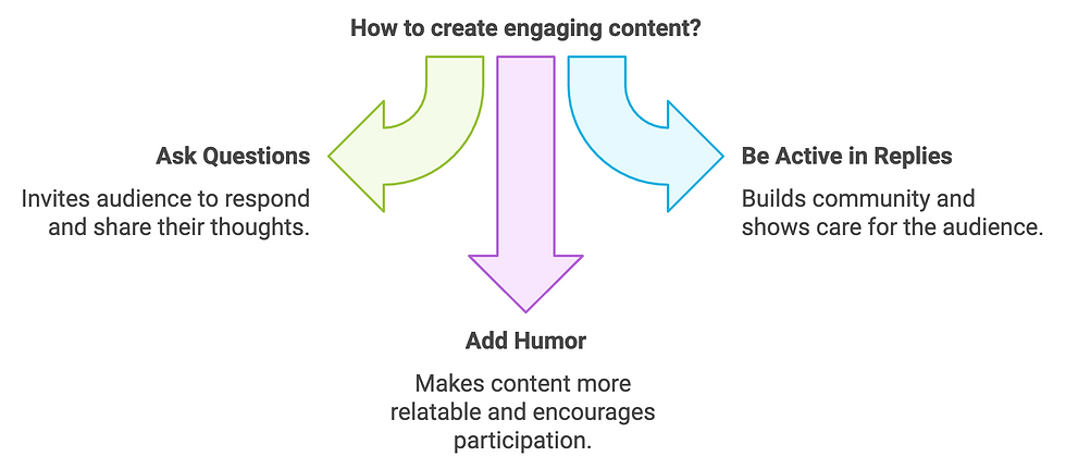
9. Interaction: A Conversation, Not a Monologue
Content isn’t a one-way street. Whether you’re writing a blog, posting on social media, or sending out a newsletter—the goal is to spark a conversation. Ask questions, invite people to respond, and make it easy for your audience to engage.
Be active in your replies. If people take the time to comment on your post, take the time to respond. This helps build a community and shows that you care about your audience. And trust me, people appreciate that. Who doesn’t love a little digital pat on the back?
Oh, and don’t forget to add some humor to your content. It doesn’t all have to be super serious. A joke here and there, or even a touch of light sarcasm, can give people that extra nudge to keep reading or to join the conversation.
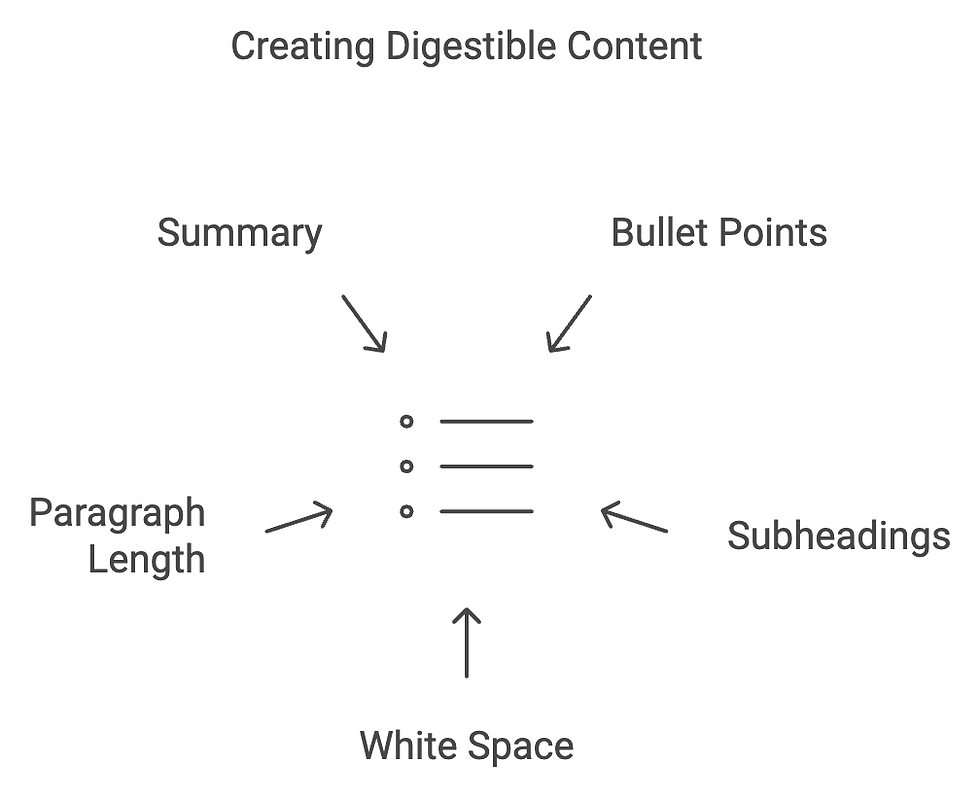
10. Structure: Keep It Digestible
No one likes long blocks of text. When people see an article that looks like a wall of words, they often run away before reading a single line. That’s why a clear structure is essential.
Use bullet points, subheadings, and white space. Think of it as breaking a dish into smaller bites—it’s easier to digest. A good rule of thumb: if a paragraph is more than three to five sentences long, see if you can split it up. You want people to be able to quickly scan your text and pick up the key points.
Add a summary at the end of your article. It’s like the final course of a meal—a small dessert that ties everything together. A few sentences that recap the main points give readers a clear sense of what they’ve learned and encourage them to take action.
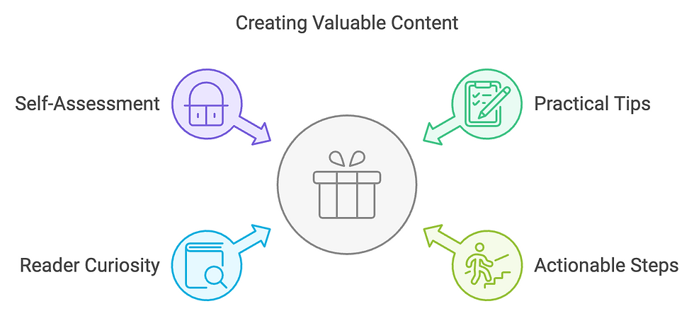
11. Content Filled with Value
You might wonder, “What do you mean by value? Do I have to give away every secret and tip for free?” Yes and no. Value means giving the reader something they can truly benefit from.
If your blog is about content creation, provide practical tips that people can put into action right away. Don’t just tell them why good content is important; show them how to achieve it. The trick is to give readers enough to help them, while leaving them curious enough to want to learn more.
A good rule of thumb: ask yourself, “Would I find this useful if I read this blog?” If yes, you’re on the right track. If not, try to go a step further and ask yourself what concrete steps you can share that will truly make a difference.

12. Publishing: Timing & Consistency
Publishing is a bit like feeding a Tamagotchi—you have to do it consistently, or people will go elsewhere. Set up a schedule and try to stick to it. Whether it’s weekly, biweekly, or monthly, consistency helps your audience know when to expect new content from you.
Choose a time to post that aligns with your target audience. For some businesses, that means early mornings; for others, it’s late at night. Do some research to find what works best for your specific audience.
And finally: promote your content! Share your blog on social media, send it to your newsletter list, and don’t forget to include a CTA that invites people to share or explore further.
Conclusion
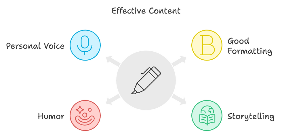
Content creation can feel like a giant buffet you have to sift through, but with the right steps, you can turn it into a delicious experience. Focus on good formatting, use storytelling, add a dash of humor, and don’t be afraid to let your own voice shine. With these elements, you’ll create content that’s not only read but also remembered—and that’s exactly what you want to achieve!
Ready to dive into your own content kitchen? Stay tuned on the blog for more practical tips to take your content to the next level.
Comments